
Logo
All materials can be found within the Export Google Drive.
Brand Colors
Usage
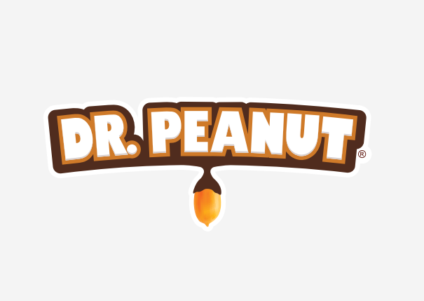
The logo identifies the Dr. Peanut brand as a whole. Use this mark to identify locations, products, services, and materials. This logo is a carefully crafted piece and cannot be altered in any way.
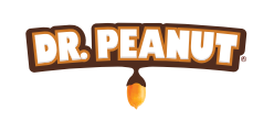
The secondary logo is a simplified version of the main brand. Its use applies to specific situations. This variation should not be used as the primary application.
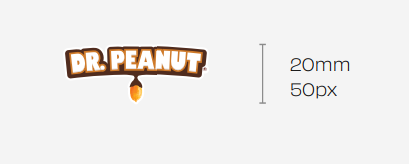
Size and spacing
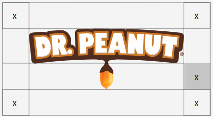
As a general rule, the more negative space around the brand, the better. At a minimum, there should be negative space equal to the value of X shown beside it.
Background control

The minimum brand application size is 20mm in height for printed applications or 50px for digital applications.

Common mistakes
Do not distort, compress, or modify the logo's shape in any situation.
When used in isolation, do not rotate the logo.
Do not change the logo's colors; only use the approved colors in this material.
Do not alter the format and proportion relationship between the elements of the logo.

Contrast is the term used when considering the logo's placement on any background.
Our logo should not only be legible but should also provide clarity and make a strong case for its presence. If there is no significant contrast with the background, our logo loses strength.
Due to our white space protection area, our logo can be placed over photographs, textures, and patterns, as long as the contrast between it and the background is extremely visible.

Do not apply graphic effects to the logo, including shadows and highlights.
Do not crowd the logo. Respect the clear space and composition.
Main colors

RGB: 255, 255, 255
HEX: #fffff

PANTONE: BLACK C CMYK: 75, 65, 65, 80 RGB: 20, 20, 20
HEX: #141414

Always use the Pantone system to ensure the accurate reproduction of materials at every touchpoint. If it is not possible, whether due to availability or production budget, take great care to match shades as precisely as possible.
If necessary, use 20% while maintaining legibility as the primary factor. Any hue below 60% should be treated as a background that requires black text.
Nearly all the colors in our primary palette can be used in any combination. Whenever possible, seek the best legibility and contrast, especially in regard to text and typography.
Common mistakes


PANTONE: ORANGE 021C
CMYK: 0, 80, 100, 0
RGB: 231, 78, 15
HEX: #e74e0f
Typography
Any typeface not included in this material is considered unapproved for use.
PANTONE: 2685C
CMYK: 98, 100, 22, 13
RGB: 51, 0, 114
HEX: #330072
Do not combine light backgrounds with gray. Contrast and readability will be compromised.
Do not change the colors in any way. Color consistency is vital for brand recognition.
Do not combine backgrounds with shades of the same color as the content. Contrast and readability will be compromised.
Do not use shades as primary colors. They should only be used for effects and secondary tones.

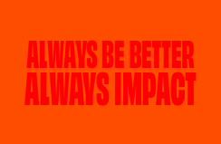
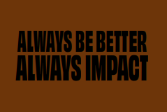
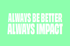
Main typography
Obviously is our primary font, a commanding typeface brimming with personality. Thanks to its 'variable' nature, the font gives designers unrestricted freedom for creation.
Due to its wide range and uniqueness, our font should be used in every brand material execution.
You can dowload it here.
Note: you need to have an Adobe account and subscription in order to download it.
In the rare occasions when this is not possible, the font Roboto, found on Google Fonts, can be used.
Note: this should not happen frequently.
Do not combine dark backgrounds with black hues. Contrast and readability will be compromised.
Do not use colors that are not approved for the brand, especially in combination with the approved colors."
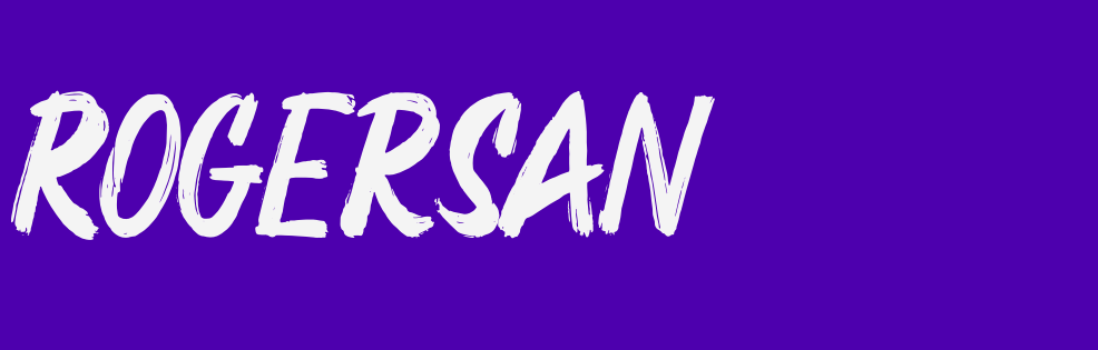
Complementary
Rogersan is our complementary font, a 'brush' typeface designed to highlight words and phrases.
The font was chosen for its looser and urban character, complementing our identity.
You can find it here.
The Rogersan font should be used in every brand material execution. In the rare occasions when this is not possible, the Permanent Marker font, found on Google Fonts, can be used.
Note: this should not happen frequently.
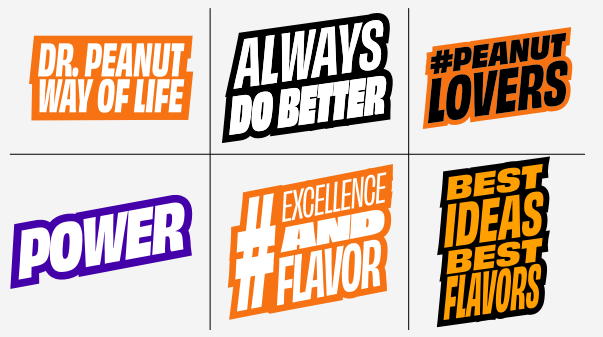
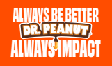
Stickers
We have developed various stickers with phrases from our brand platform. With different fonts, colors, and angles, we've achieved a wide range of combinations of these elements that can be used in various Dr. Peanut materials.
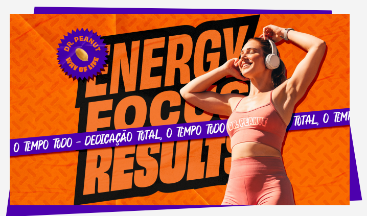
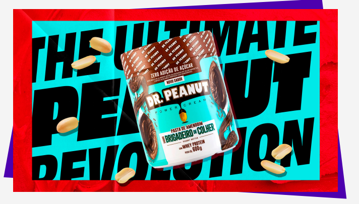
Key Visuals
When creating, think about the layout in 4 layers, which are separated by:
A. Products
B. Stickers
C. Typography
D. Textures
Photography
Guidelines for photographic compositions, content, tone, and usage. This standardization will ensure brand experience consistency throughout our entire image library.
Strips
To create our layouts, we have developed strips that combine our colors and fonts, creating elements that can be used in various materials.
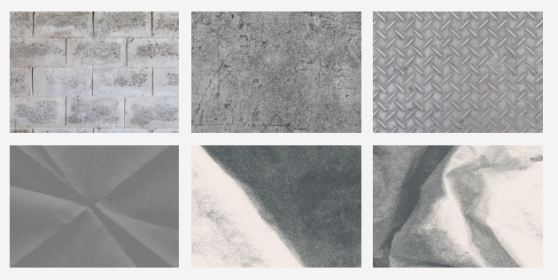
Texture
People

When used in the ideal way, textures provide depth to compositions. When using textures, consider urban and gym-related elements.
Examples

People are at the heart of our business and should be treated with the highest level of respect during photo sessions. Whenever a person is the key element in our photograph, they should appear relaxed, happy, and at ease. To enhance the natural feeling, aim to capture the photograph when people are engaged rather than asking them to pose for the photo. Our products should be present, with the person interacting and highlighting them.

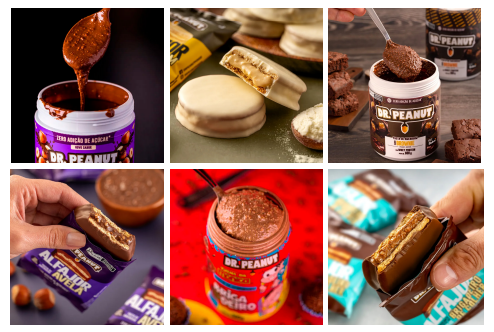
Products
Product photographs are used on the website, in advertisements, social media, and sales materials. Products should be photographed to highlight texture, with packaging appearing complementarily in the frame. Backgrounds should be simple, clean, and out of focus for the main photos. Detail shots can emphasize specific product features and should use depth of field to establish a clear and prominent focal point.
Copyright © All rights reserved 2023
Please contact our Export Designer:
Mylana de Oliveira
mylana.oliveira@drpeanut.com.br
+55 41 991 471 454